Regular readers, God bless ‘em, will know by now that I am not a fan of over-complicated, gimmicky technical analysis. Complex patterns that need a lot of explaining are, more often than not, coincidences rather than reliable signals, and will always mean absolutely nothing should fundamental conditions change. There are, however, times when reading charts can actually tell investors something useful, and now is one of them.
What is different right now is that the move that we are seeing is one based on a fundamental change in conditions that we already know about. It has been obvious for some time that inflation is with us, and that the Fed would eventually have to notice that and tighten monetary policy in response. The only questions are how bad inflation turns out to be, and how drastically the Fed responds. Daily volatility has been based on those two things, but the overall direction has been both clear and logical. Still, it will end eventually, and when that is the case, the chart can be useful in identifying a potential endpoint for the move.
So, what is the chart for this move down saying?

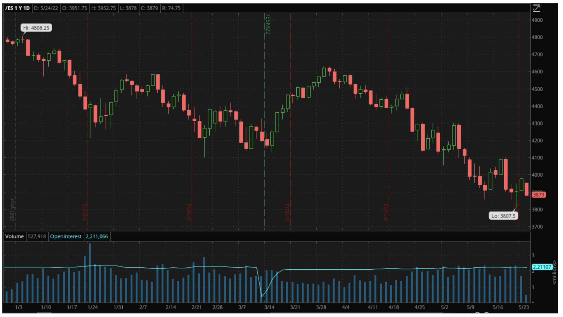
When I look at the year-to-date chart for the E-Mini S&P 500 futures contract above, there are a few things that stand out.
First, it has been an uneven move down, with a lot of day-to-day swings in direction as well as some sustained moves up and down. The nature of most of those daily swings are what interest me the most though.
Candle charts such as the above are the type most frequently used by traders because they give a clear picture of price action during each day rather than just the closing price. One horizontal line on each candle represents the opening price and another the closing, with the thin lines, or wicks, protruding above and below those horizontal lines indicating intraday prices outside the opening and closing prices. The candles are color coded, with red representing down days, when the closing was below the opening, and green the up days, when the opposite occurred.
The interesting thing about this chart is that almost all of the down day, red candles have tiny or no wicks above the top line, indicating that the opening was the high point of the whole day. In many cases, that opening was above the previous day’s close, meaning that the smaller futures players in the overnight market were bullish, but the big boys playing when the U.S. market opened sold heavily and forced the contract lower. That is consistent with a sustained move down, and that move is unlikely to end until the reverse starts to happen, when early pessimism is met by optimism and strong buying once the big boys come in. That is what investors looking for a bottom should be looking for, early losses turning into gains, not the other way around.
There are also a couple of things about this chart that suggest we may not be far away from that happening, one technical and one psychological.

The technical indicator is the shape of the candle that was formed on Friday. It is what is known as a “doji” to chart readers, a long vertical line with a thin horizontal line forming a clearly defined cross shape. A doji indicates that there was a battle between buyers and sellers on that day. Both had the upper hand at different times, hence the long vertical line, but it ended in a tie, with the opening and closing close enough to each other to create that thin horizontal line.
To technical analysts, a doji like that indicates the end of a long-term move and a potential change of direction because it suggests that the previously dominant group, in this case the sellers, are running out of steam, and the bottom of that cross is the point at which the sellers retreated. Logically, that then becomes a strong support level. So, if 3807.5 holds this week, we may have seen the bottom of the move down, at least for a while.
That is made slightly more likely by the psychology of traders, something that decades in dealing rooms around the world has taught me is an often overlooked but huge influence on markets. From that perspective, the selling can be seen as a kind of punishment. Stocks had allowed themselves to get overbought despite the obvious risks of inflation and rate hikes, and that must be corrected. Still, like all civilized punishments, the aim is to do enough to teach a lesson, but not to kill the punished.
The punishment therefore has to have an endpoint, and the very human search for that endpoint leads to it usually coming at a logical point such as a round number or maybe a drop of a certain percentage. That makes the fact that the S&P 500 has challenge a level that would represent a 20% drop and a bear market multiple times before reversing seem very significant and lends even more weight to Friday’s low as a support level.
Of course, if economic data and corporate earnings continue to suggest, as they have recently, that inflation is worse than feared and is having a profound effect on corporate profits even before rate hikes start to impact demand, none of this will matter. In that case, twenty percent is not enough to even reflect reality, let alone punish stocks for their prior profligacy, and we will continue lower. What the chart does do though, is to tell us that absent further bad news, it is possible that we have found a bottom and that at least offers some hope to beaten down investors.
The views and opinions expressed herein are the views and opinions of the author and do not necessarily reflect those of Nasdaq, Inc.

