The call put ratio can often reflect the bullish or bearish views of options traders, with more calls trading indicating bullish sentiment.
Calls represent bullish bets on the underlying and are much more popular in individual stocks than in indexes like SPX. Comparing the call volume to the put volume shows interesting sentiment of retail versus institutional traders especially around highs and lows in the market.
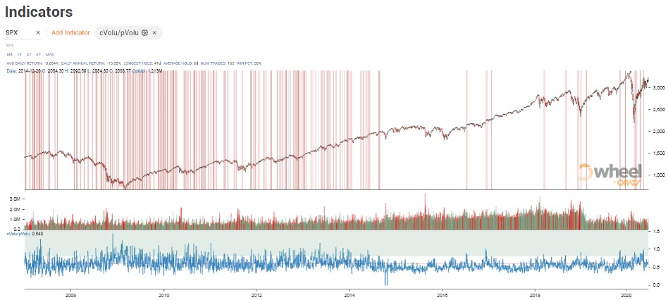
The ratio is often used as a relative measurement to its normal level for symbols. For example, the SPX call volume lagged put volume over much of the time since 2007 averaging only 55% as shown below.

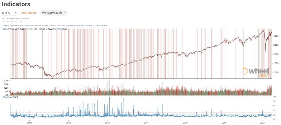
Whereas, the call/put ratio average for the S&P components, as represented by the symbol SPX_C in the ORATS Wheel Chart below, has averaged 150% since 2007.

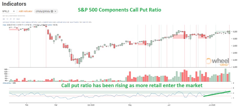
Recently, with the pouring in of retail traders into the market, many through the trading app Robinhood, calls are outstripping puts by 200% for the average component.

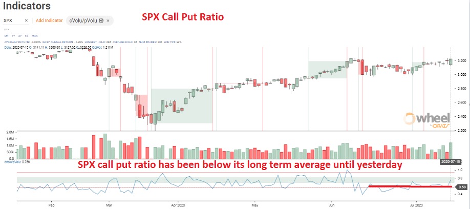
Contrast this with the index SPX. Recently, the SPX call put ratio has been below its long term average until yesterday.

Generally, the SPX represents institutional smart money and the components represent retail traders.
Near the bottom of the Covid crash, the SPX call/put was above its normal 55% hitting 100% a few days after the bottom. More institutional traders were buying calls than normal during this opportune time.
The crash saw the S&P components call/put below its average, only rising to its long term average near the top of the shaped recovery. Retail traders did not get the memo that the bottom was in and were not buying calls in earnest until after the big recovery run up.
Matt Amberson was quoted in the Reuters pointing out this ratio.
More reading can be found here, on the ORATs blog.
The views and opinions expressed herein are the views and opinions of the author and do not necessarily reflect those of Nasdaq, Inc.
