MoneyMorning.com Report - It's no secret that I like to zero in on the top 250 stocks in the market. And I've even shown you how to whittle those down to the 10 best stocks to trade at any given time.
But even then, that's a lot of data to digest. So you have to employ the best methods to assess which stocks are going to move the way you want them to - that is, profitably.
There's no shortage of stock charts out in the wild. These days, anyone can go on Yahoo! Finance or Stockcharts.com and pull up highly customizable charts for pretty much any stock trading on domestic markets.
There's so much information available it can be completely overwhelming, even if you've been trading for a while.
Today, I'm going to share with you my favorite type of stock chart and give you everything you need to start seeing your trades like a pro.
Let's get started...
Why I Favor Japanese Candlestick Stock Charts
Japanese candlesticks were created in the 18th century by an Osaka rice futures trader named Munehisa Homma. The foundation of his candlestick technical analysis was Sakata's Five Methods, which were patterns used by local traders from his home town of Sakata.
Japanese candlesticks have evolved and become more and more prevalent in the current day thanks to Steve Nison, who introduced them to the West.
Every chart you have seen from me has been a Japanese candlestick chart. Like many professional traders, I favor these charts because of the story they tell over and above your basic bar chart.
Both chart styles are similar in that they show what happened over the period of time each of them assesses. They both show the open, high, low, and close (O, H, L, C) of the period they represent (in fact, a bar chart can also be called an OHLC bar, since that is what it shows).
Either can represent a day, week, or month. On an intraday basis, they can represent a one-minute, five-minute, or hourly period of time.
But that's about where the similarities end...
The Construction of the Japanese Candlestick

The opening and closing price of the period measured (which for our purposes here will be one day) make up what is called the candle body. The vertical lines on the top and bottom of the candle body are called the shadows, or the wicks.
If prices closed higher than the open, it is a bullish day and is usually represented by a white or green body. If prices closed lower than the open, it is a bearish day and is usually represented by a red body.
The size of the candle body and the size of the shadows (if any) are what give the various types of the candlesticks their unique names (think Inverted Hammer, Spinning Top, Doji, etc.). When two or more consecutive candlestick days form a specific visual pattern, those two- and three-day patterns have their own names and indicate potential future price moves in a stock.
The Only Candlestick Patterns I Look For
Candlestick patterns are either classified as a reversal pattern (which signals a price reversal) or a continuation pattern (which signals a continuation of the existing trend).
I favor the reversal patterns because they give me the chance to get in at the best price with the potential for a nice upside run with minimal risk.
Candlestick patterns are anywhere from one to three days in length.
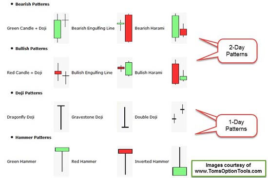
One-Day Patterns: The most frequent one-day candlestick patterns are the Doji (in its various formations - Long Leg, Dragonfly, Gravestone, etc.), the Hammer, the Inverted Hammer, and the Hanging Man.
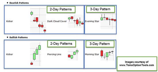
Two-Day Patterns: These include the Bullish/Bearish Kicker, the Bullish/Bearish Harami, the Piercing Pattern, Dark Cloud Cover, and Bullish/Bearish Engulfing patterns. Because these patterns play out over two trading days, they have more significance than the one-day patterns.
Three-Day Patterns: I favor the Morning Star and Evening Star reversal patterns. Three-day patterns are the most significant because they are formed over three periods of activity with a lot moreof the markets' participants and their sentiment on the underlying playing out over three days.
Let's take a look at a couple of recent examples of one- and two-day patterns (you'll get a good look at a three-day Morning Star in the very last chart)...
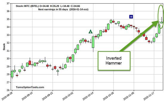
One-Day Pattern: Inverted Hammer on Intel Corp. (Nasdaq: INTC)
A bit more technical view on Intel Corp. (Nasdaq: INTC) is that the Inverted Hammer or Shooting Star (an Inverted Hammer in an uptrend) candlestick has taken place on what could be considered resistance.
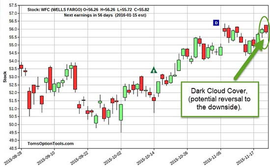
Two-Day Pattern: Dark Cloud Cover on Wells Fargo & Co. ( WFC )
Here is a potential reversal pattern on Wells Fargo & Co. ( WFC ). As you can see, the last trading day is a bearish reversal day, where the candle body dipped down into the previous day's candle body. If you're counting on a reversal, the more it closes in the previous day's body, the better.
Note that the candlestick reversal pattern has formed at what can be deemed an area of resistance.
Where the Pattern Happens Is Just as Important as the Pattern Itself
You want the appropriate reversal pattern to happen at support and resistance. If you have a bullish reversal candlestick or pattern at resistance, it is NOT a reversal pattern. A bullish reversal is a pattern that should reverse to the upside. If you are already at the top of a trend or at the top of a range, the bullish reversal formation may be there, but it can't "reverse" and continue going higher.
At the top of a trend or range, you want to look for a bearish reversal so you can trade the stock to the downside.
At the bottom of a trend or range, you want a bullish reversal so you have a reason to trade the stock to the upside.
Look at the chart on INTC again. If this one-day candlestick is to represent indecision and a possible reversal, it should be more legitimate because it happened at resistance and could reverse down from there.
This is also the case for WFC. If this two-day pattern is signaling a reversal, it should be more likely to reverse to the downside from this resistance point.
But that's not always true. Take a look at this chart on Chevron Corp. ( CVX ).
The August sell-off was a steep move to the downside. The two-day formation circled in the chart above looks like a Bearish Engulfing Pattern, which is a signal of reversal to the downside.
But take a look at the preceding few days - CVX was already in a bearish trend. If prices on CVX were to reverse, it would be a bullish reversal to the upside. This can't be called a Bearish Engulfing Pattern because it can't reverse to the downside if it's already headed in that direction.
Remember, off a support or low of a trend, you want to see reversal signals to the upside. In those scenarios, you want to see bullish reversal patterns.
Now, let's take a look at one last chart, which shows more recent price action for CVX...
If you deem $88 support, then you will see three separate bullish reversal patterns at this support area:
- Morning Star Reversal (three-day pattern)
- Bullish Engulfing (two-day pattern)
- Piercing Pattern (two-day pattern)
Now, the stock hasn't made a sustained strong move in price to the upside. It tried to off the Morning Star Reversal, but came back to support. You can see the battle between bullish and bearish traders at this $88 price area. Still, the bullish reversal patterns indicate that this stock may favor a move higher.
Now, taking a quick glance at a candlestick chart isn't enough when it comes to deciding which stocks you want to trade. It is best to combine these patterns with other "Western Technicals" to support your analysis, such as support and resistance, moving average lines, MACD, and stochastics, to name just a few.
That will give you a clearer picture of where a stock's price is headed.
Follow us on Twitter @moneymorning or like us on Facebook .
How to Take a Loss: Losses are a fact of trading. To trade successfully, you need to learn how to lose appropriately. Your ability to manage your losses truly speaks to the profitability of your trading business. Because your losses are their gains, those on Wall Street would prefer you didn't learn this lesson...
To get full access to all Money Morning content including our latest Premium Report, "How to Make 2015 Your Wealthiest Year Ever," click here
About Money Morning: Money Morning gives you access to a team of ten market experts with more than 250 years of combined investing experience - for free . Our experts - who have appeared on FOXBusiness, CNBC, NPR, and BloombergTV - deliver daily investing tips and stock picks, provide analysis with actions to take, and answer your biggest market questions. Our goal is to help our millions of e-newsletter subscribers and Moneymorning.com visitors become smarter, more confident investors.
Disclaimer: © 2015 Money Morning and Money Map Press. All Rights Reserved. Protected by copyright of the United States and international treaties. Any reproduction, copying, or redistribution (electronic or otherwise, including the world wide web), of content from this webpage, in whole or in part, is strictly prohibited without the express written permission of Money Morning. 16 W. Madison St. Baltimore, MD, 21201.
The views and opinions expressed herein are the views and opinions of the author and do not necessarily reflect those of Nasdaq, Inc.