By Frank Holmes
By now you’ve heard that the annual rate of inflation hit a 41-year high of 8.5% in March. Prices for food, energy and used vehicles increased the most, with preowned cars and trucks jumping 35%, gasoline 48%.
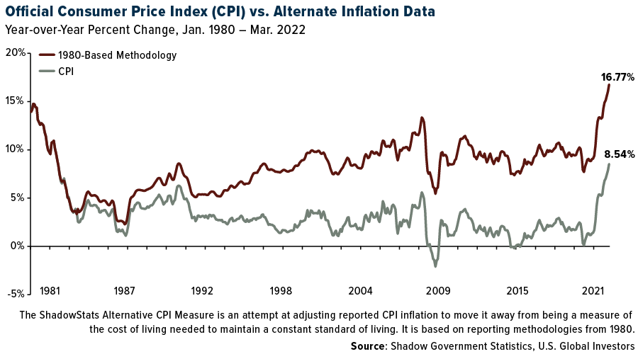
But here’s something you may not know: The Bureau of Labor Statistics (BLS), which issues the monthly consumer price index (CPI), has changed its methodology for measuring inflation more than twice over the past few decades. Today’s CPI doesn’t actually tell us how much prices have changed; instead, it allegedly tells us changes in the cost of living.
This is why, in 2020, I called the CPI “fake news.” In reality, inflation as you and I understand it is running much higher than reported.
If we use the BLS’s methodology from 1980, prices actually increased 16.8% last month, which is almost double the official CPI print. The data below is courtesy of economist John Williams’ Shadow Government Statistics.

The Biden Administration blames the “Putin price hike” for elevated prices, particularly energy prices. This is simply more fake news.
Don’t get me wrong. The war in Ukraine has contributed to inflation in the short term. But there’s much more to the story, which began way before Russia invaded its neighbor.
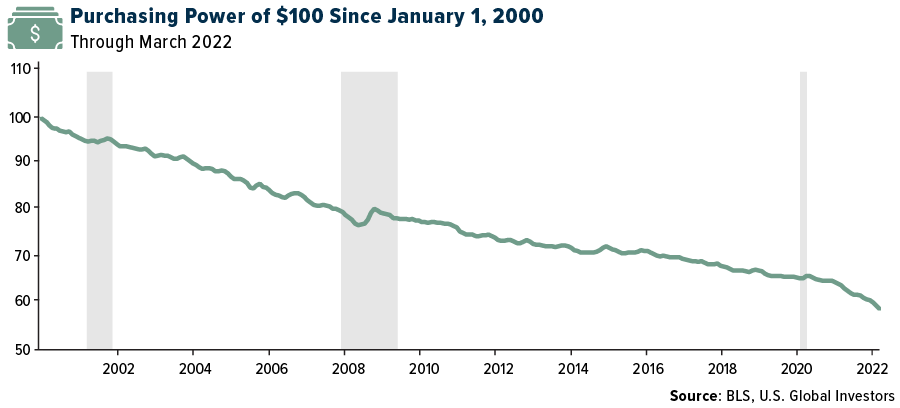
From $100 To $58 In Only 20 Years
Since the start of the pandemic, rampant money-printing by central banks, including the Federal Reserve, has flooded the economy with cheap liquidity. It’s difficult to say exactly what percentage of U.S. dollars in circulation was “printed” in the past two years, but suffice to say, it’s a huge amount. We can go back even earlier, to the first round of quantitative easing (QE) in 2008, when the Fed lowered rates to near zero and began buying $600 billion in mortgage-based securities (MBS).
This, combined with the ongoing knock-on effects of pandemic-related closures and lockdowns, has inflated prices to the extraordinary levels we’re witnessing today.
Here’s another way to look at it. Imagine it’s 2000, and let’s say a shopping cart of groceries costs you $100. Today, the same number of greenbacks would get you only $58 worth of the items in that basket of goods from 2000. That’s 42% fewer groceries on average for the same price. If you look at the chart closely, the deterioration of the U.S. dollar has only accelerated in the months since the pandemic.

Putin may have won his first term as president of Russia in 2000, but I assure you he’s had nothing to do with any of this.
We’re Not Looking At Stagflation Just Yet
The good news is that economic conditions are not nearly as bad as they’ve been in prior periods of high inflation. Many comparisons have been made between now and the 1970s, with some calling Biden another Jimmy Carter.
The problem with that comparison is that Carter was dealing with not just sky-high inflation but also surging unemployment, a toxic mixture that often results in stagflation. What’s more, when Carter left office in January 1981, the headline interest rate was above 19%, which kneecapped economic growth.
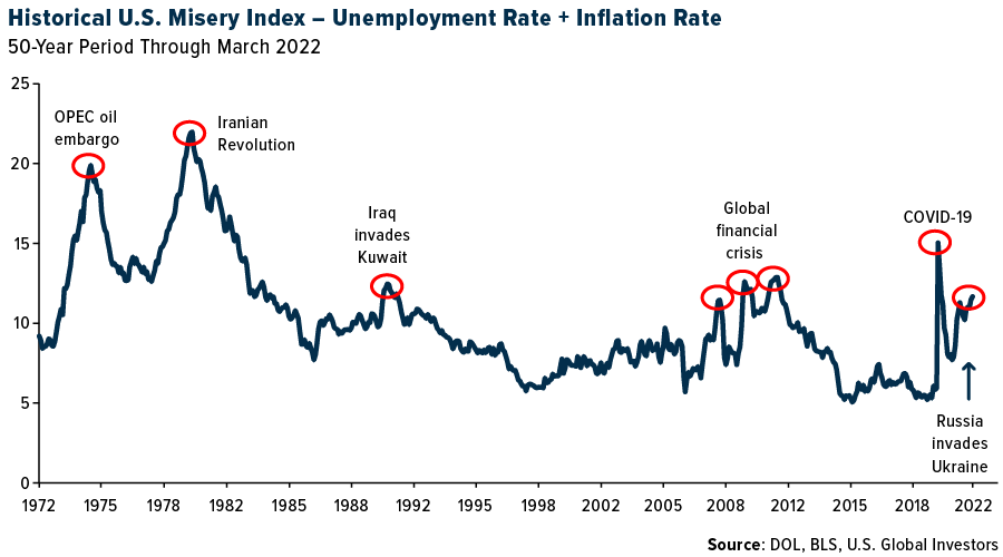
Fortunately, unemployment today is at historically low levels, so we’re not looking at stagflation just yet. Below is the Misery Index, a stagflation proxy that combines the unemployment rate and inflation rate. As you can see, the U.S. is still well below the 1970s, but the line is clearly going in the wrong direction.

Stagflation has historically been triggered by a supply shock—note the timing of the OPEC oil embargo of the early 1970s and the 1979 revolution in Iran, a major oil producer. As of right now, Russia has not embargoed exports, but that could be a huge risk. The country is not only a major oil exporter, but it’s also a leading producer of palladium and platinum, natural gas, potash, nickel, aluminum and gold.
And then there’s Jerome Powell, whom I don’t envy. As I already pointed out, the unemployment rate is very low, but that could change overnight if the Fed raises rates too much too fast. The risk I see here is that, to keep the economy going at current levels, we must take a page out of Japan’s playbook and perpetually rely on highly accommodative monetary policy, and anything less than that will trigger a recession.
Did Someone “Orange-Pill” Janet Yellen?
So what’s the solution? As I heard many times at last week’s Bitcoin 2022 conference in Miami, “Bitcoin fixes this.” It’s the “escape hatch” from the current monetary system. As a completely decentralized, open-source asset, it has no board of directors, no governor or CEO.
Also at the conference, I heard many people talk about being “orange-pilled,” or “orange-pilling” their friends and family. This is a direct reference to the Matrix film series: Neo, played by Keanu Reeves, takes the red pill to “wake up” from the artificiality of the world around him and see it for what it truly is—a lie.
Similarly, people who “take the orange pill” recognize that the centralized, closed-source monetary system is stacked against them, and that Bitcoin is the solution.

My question is who slipped the orange pill to Janet Yellen? The former Fed chair and current Treasury secretary has never stood out to me as a Bitcoin fan—in 2018, she called it “anything but useful”—but in a speech earlier this month, Yellen seemed to make an about-face.
She highlighted Bitcoin’s ability to reduce “reliance on centralized intermediaries like banks and credit card companies” and made reference to its “novel method for validating transactions using cryptography.”
During their panel at the Bitcoin 2022 conference, ARK Invest chief Cathie Wood and MicroStrategy founder Michael Saylor praised Yellen’s acknowledgement of Bitcoin’s appeal and benefits. Michael, in fact, went so far as to call the speech a “green light” for Bitcoin. He repeated the line again last week at the Exchange ETF conference.
Granted, Yellen likely has her eyes set on creating a U.S. central bank digital currency (CBDC), but I believe Bitcoin will be allowed to compete in the race.
If you haven’t seen my video on why I think CPI is fake news, you can do so by clicking here!
Originally published by U.S. Global Investors on April 18, 2022.
For more news, information, and strategy, visit ETF Trends.
All opinions expressed and data provided are subject to change without notice. Some of these opinions may not be appropriate to every investor. By clicking the link(s) above, you will be directed to a third-party website(s). U.S. Global Investors does not endorse all information supplied by this/these website(s) and is not responsible for its/their content.
The misery index is meant to measure the degree of economic distress felt by everyday people, due to the risk of (or actual) joblessness combined with an increasing cost of living. The misery index is calculated by adding the unemployment rate to the inflation rate.
The views and opinions expressed herein are the views and opinions of the author and do not necessarily reflect those of Nasdaq, Inc.


