News & Insights


Given that it’s the holiday season, we figured it’s the season to tackle seasonality.
We look at some of the commonly cited trends and see if they are supported by the data or more like Santa (something we just want to believe in).
Is there a season for stock returns?
There are a few well-known return effects that are meant to play out at different times each year.
In the chart below, we take a look at the so-called “January Effect,” “January Barometer,” “Sell in May and Go Away,” and the “Santa Claus Rally.” We use the Dow Jones for market returns each year since it has returns dating back to 1930.
One thing that stands out is that although the “average” return for the year is around 7.2%, it is rare that the year ends with a return anywhere near “normal.” In fact, the chance that the market returns between 5% and 10% is just 8.5% (8 times out of 94). In short, anyone predicting the market returns to be close to average will probably turn out to be wrong!
We also see that the market is more likely to go up than down, with up years making up 59 years out of 94 (or 63% of times) with a notable positive skew to the results.
Chart 1: Looking at market prices over a year (for the past 94 years)
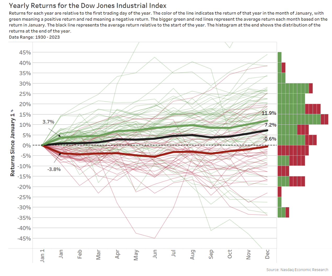
The January Effect posits that, in January, stock market prices have the tendency to rise more than in any other month. The intuition for the effect is that there is a rebound from “tax loss selling” at the end of the year (which seems to go against the Santa Claus Rally we also discuss below), which is then offset by reinvestment (buying) in January.
Looking at the data, the average (black line) doesn’t seem to support this as a market-wide phenomenon:
- December is not weak (also see Santa Claus rally below).
- January is not especially strong (Average January return, at 1%, ranks as only the fifth best month).
- January is also not an especially positive month. January returns are positive 62.8% of the time, suspiciously close to the annual average above.
This brings us to the January Barometer.
The January Barometer is a market hypothesis stating that returns in January predict those for the rest of the year. The lines in Chart 1 are colored based on whether January is positive or negative. We can follow whether a positive January results in a positive year (and vice versa) by following the lines through to December. The boxes to the right count how many lines fall in each 5% return group.
As the endpoint of the colored lines shows, a positive January does not mean a positive year (and vice-versa). In fact, some of the best annual returns started with a negative January, and three of the four worst years saw a positive January.
In fact, as the histogram on the right of the chart shows, out of the 94 years in the data:
- 14 out of 35 (or 41%) of down Januarys ended positive.
- Meanwhile, nine out of 59 (or 15%) positive Januarys ended down.
On a year-by-year basis, what happens in January doesn’t always show how the year will end.
However, a positive January does tend to result in a more positive next 11 months. We show the average returns for positive and negative January’s with the thicker green and red lines. That data shows that:
- When January is positive, it averages 3.7%. The rest of the year, we see gains of another 8.2%, adding to 11.9%
- When January is negative, it averages -3.8%. The rest of the year, we see gains of 3.1%, adding to a full-year return that is just negative, at -0.6%.
So, we could say the January barometer seems to work “on averages.”
“Sell in May and go away” is one of the most recognized seasonal trade strategies. It theorizes that investors sell their equity portfolios on May 1 (to hold cash) before heading out of summer vacation, which reduces the “buying” pressure on stocks until Halloween.
It’s a little hard to see on the scale of the chart above, but market returns certainly don’t flatten. There may be evidence for selling in May, as May has negative average returns. However, July has the best average monthly return, up 1.6%. Furthermore, there is little evidence of “reinvesting” at the end of summer, as September is the only other month with a negative return.
In reality, professional portfolio managers can’t afford to be in “cash” for that much of the year. It increases tracking error and the risk that they underperform the market.
A Santa Claus rally is the sustained increase in the stock market that occurs around the Christmas holiday – from Dec. 25 until the end of the year.
The long-run average does seem to show the last quarter has stronger returns than the rest of the year, and December is the third-best month of the year with an average return of 1.3%. However, there doesn’t seem to be a notable change in trajectory (in the black line) in the last week of the year.
Looking at the thin red and green lines (for each year), we also see evidence of “naughty” years, where Santa doesn’t come. In fact, just over a quarter of all December returns are negative.
Volatility wavers during the year
We all know October is the month of Halloween. But is it really the scariest month of the year?
Looking at “extreme” monthly returns in Chart 2 below (which shows years where a monthly return was more than +/-10%), we see that September and October have both been scary months, with 11 negative years showing in the chart. However, five of those years occurred during the great depression in the 1930s, and one of the others was the infamous Black Monday, which happened in October back in 1987 and saw the single worst daily return in the U.S. market’s history. Since then, market-wide circuit breakers have been implemented, meaning that can’t happen again. However, it went close to hitting them back in 2008, in the depths of the credit crisis (which also showed up in October).
So, it would seem that October has, in the past, been a very scary month!
Interestingly, July (which has the most positive average return) may be the most boring month – appearing just once – when it was up over 10%.
Chart 2: Looking at returns greater than 10% over a month (for the past 94 years)

We could also look at the VIX, sometimes called the “fear gauge,” to see if October is scary.
The VIX has only been running since 1993, so it’s not old enough to remember Black Monday. But looking at the average deviation of VIX from its average level each year (yellow bars), we do see some seasonality:
- Q1 generally has above-average volatility. However, that period was impacted by the lingering effects of the credit crisis in 2009 and the onset of Covid in 2020. Hard to blame the seasons for that!
- April to July have below-average volatility.
- Then, toward the end of September, volatility returns and is highest on average in October, just in time for Halloween.
That actually seems to support the “Sell in May” theory, as well as showing that October is, in fact, a scary month.
However, if we look at the shading (which shows the relative VIX for each year), we see that the Great Recession made October 2008 especially volatile.
We also see that July has the fewest years with elevated VIX – consistent with the slow but steady return data discussed above.
Chart 3: Looking at volatility over a year (for the past 31 years)

Volumes have seasonal trends, too (holidays are slow)
We have previously looked at how volume changes during the day, the so-called VWAP smile.
The chart below looks at volumes during each whole year (for every year since 2009).
Similar to the charts above, we show each year’s “relative” weekly volumes (compared to the average for that year) in grey, and then the average of all years is purple.
This chart also shows the market is typically more active in Q1, which is mostly sustained until late June (when Russell’s annual reconstitution happens).
Then summer seems to be consistently dramatically slower. There are almost no times where weeks in July saw average volumes for the year. Interestingly, July has consistently below-average volumes, the best monthly returns, and some of the lowest volatility.
Some events have caused summer volumes to spike, such as the S&P credit downgrade back in August of 2011. But in general, volumes stay below average all the way until late October (most grey shading is around 20% below average for that year). This “quiet summer” phenomenon with volumes seems to mostly line up with the return-based “Sell in May” theory – but maybe what is happening isn’t “selling” but “holding” in May, as analysts go away for their holidays.
Also of note, and timely for this week, is how quiet the end-of-year holiday season also tends to be.
- The week of Thanksgiving in late November typically sees volume drop around 20% for the week. However, remember that’s also just a 3½ day week for traders, with an early close on the Friday after the Thanksgiving holiday.
- Then, the week of the so-called “Santa Claus Rally” (the week after Christmas) is even quieter, with volumes down more than 30% and almost no weeks that were above average.
We also point to a number of other events, which seem to explain most of the large spikes in volumes. This shows that traders trade more when there is uncertainty – and new price discovery needs to occur.
Chart 4: Weekly volumes over a year (since 2009)

Election might cause return trends, too
Of course, with 2024 about to be a U.S. election year, this is a good time to look at what happens on a rolling four-year basis (starting with each new presidential term).
We can see from the grey bars below that the first and third years of a president’s term seem to be the best, with the third year seeing the highest average market returns at 12.6%.
Interestingly, the year of the election itself tends to be weak. However, looking at the line chart, which shows the accumulated weekly returns over the whole period, we see that:
- In the first half of the election year, average returns are muted. That’s when primaries occur – when candidates from each party are competing against themselves, critiquing their policies and trying to get the votes to become the candidate. There are a lot of candidates and a lot of different potential policies, which may add to uncertainty.
- Once we get to the two-party (two-person) election race, the market seems to recover. Although uncertainty seems to slow returns right around the election
- Then, after the election, the market typically rallies to close out the year.
Other data suggests that volatility also increases each month as we get closer to election day. Then, after the election – when uncertainty is resolved – it drops back to “normal.”
Chart 5: Election effects (past 90 years)

Some holiday trends might be imaginary
It’s always fun to look for simple trends to use for investing. Although, given we all know about these theories, it wouldn’t say much for market efficiency if they actually led to consistent outperformance.
Looking at the seasonality data, it seems the Santa Rally and a few other things might be mostly imaginary.
On that note, we hope you all have a happy holiday. We will see you again in 2024!
Latest articles

This data feed is not available at this time.
Data is currently not available