By Zachariah Reitano, CEO and Co-founder, Ro & Aron Susman, SVP Finance, Ro
In the early days of Ro, we realized that not every team had the same level of understanding of some of the most important business metrics and how they relate to one another.
To fix that, Aron Susman (our Head of Finance) and I wrote a “Metrics Explained” which was incorporated into Ro’s onboarding process for new Ro’ers. A number of people have found this helpful so we decided to share it.
For the purposes of this explainer, all of the numbers are made up. We hope it’s helpful (especially the downloadable template payback model at the end).
THE METRICS: LEVEL 1
Let’s start with the journey of a single customer making a purchase online. We’ll then zoom out and look at memberbases on an aggregate basis.
CUSTOMER ACQUISITION COSTS => CAC
CAC is a term you probably hear frequently. Let’s break it down. Imagine you spend $10,000 dollars on a Facebook ad that is seen by 100,000 people…
Member Journey

In the case above, you spent $10,000 to acquire 50 new customers.
$10,000 / 50 = $200
So it costs you, $200 to acquire a new customer. This is your Customer Acquisition Cost or your CAC.
CUSTOMER ACQUISITION COSTS => CAC
The “customer acquisition cost” is the amount of money it costs you to acquire a new customer.
Some people exclude marketing agency fees in this calculation. For example if you pay an agency 10% of your spend to manage your FB ads.
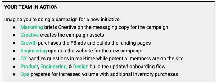
CAC is not just a Growth team number. This single number is representative of so many teams working in harmony.
Now, let’s zoom in!
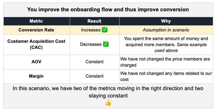
As you make each step easier and easier to complete, you are increasing the number of people who complete your onboarding flow. So imagine you make a change to the onboarding flow (e.g., add Apple pay as a payment option) and instead of 50 people completing the onboarding, 60 people complete the onboarding, which would be a massive 20% improvement.
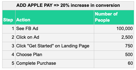
What does that do to your Customer Acquisition Cost? You’ve still spent the same amount of money but you’ve acquired 10 more customers.
- $10,000 / 60 = $166.66
- In this scenario, you’ve decreased your CAC by 16.67%!
While we zoomed in on the payment step in that example, you can imagine a similar effect if you improve other steps in the funnel (i.e., more people click on your ad).
But that was a massive 20% increase in a single step (i.e., payment screen) of the broader funnel. What happens to your Customer Acquisition Cost if each step of the funnel improves by just 4%?
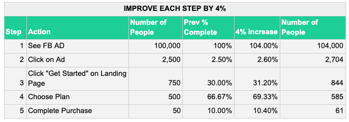
A 4% improvement in each step of the member journey leads to a decrease in your CAC by 18.04%! Remember, you spent the same $10,000 but acquired 61 customers.
$10,000 / 61 = $163.93 CAC
CONVERSION RATE
Let’s take a look at that initial customer journey again.
For every 750 people that clicked on “Get Started”, 50 completed the purchase. This means the percentage of people who completed the purchase, relative to the number of people who started is 6.66% (example conversion number).

CONVERSION RATE
The conversation rate is the percentage of people who completed a task relative to the number of people who started the task.
Note: it’s important to be specific when referring to a conversion rate, because conversion rates are relative. For example, let’s zoom in again.


The conversion rate from “Get Started” to “Choose Plan” in this scenario is 66% and the conversion rate from “Choose Plan” to “Complete Purchase” is 10%. Separating parts of the funnel and seeing the conversion rates between individual steps can help you identify the largest areas of improvement within the customer journey (ie., the conversion funnel).
AVERAGE ORDER VALUE — AOV
The name is fairly self-descriptive. If 1,000 customers spend $100,000 in January, and each only orders one item, the Average Order Value would be $100.
- $100,000 / 1,000 = $100
AVERAGE ORDER VALUE
The total dollars spent by a cohort of customers, divided by the number of orders.
Here are a few reasons AOV could change:
- Customers are selecting different order cadences (monthly v.s. quarterly)
- Customers order fewer items per order (e.g., 2x meals per order per week, 3x per order per week)
- Customers switch from a more expensive plan to less expensive plan (e.g., meat meals to vegetarian meals)
- Your company lowers the price of a plan, bringing the average down
Let’s see the impact of each potential change in action.
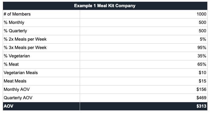
1. Members are selecting quarterly more frequently than monthly
- From 50/50 to 25/75
- AOV increases from $313 to $391
2. Members order fewer meals (i.e., quantity) per order
- Instead of 95% of members ordering 3X a week, only 65% order 3X a week
- AOV drops from $313 to $281
3. Members switch from meat to vegetarian
- Instead of 35% v.s. 65%, let’s see 65% vegetarian
- AOV drops from $313 to $277
4. You drop the price on a product
- If you drop the price on vegetarian from $10 to $8
- AOV drops from $313 to $296
Note: A decrease in AOV isn’t inherently a good or bad thing. It depends on how it relates to margin, CAC, and retention. I’ll explain how these interact from a high level later in the post.
MARGIN
There are three types of margin you often hear:
- Product Margin
- Gross Margin
- Contribution Margin
PRODUCT MARGIN
The cost of goods sold (COGS) divided by the gross sale price.
Sometimes Cost of Sale and COGS are used interchangeably, but they mean different things
Here is an example:
Let’s switch gears and use another product people often purchase online for this example: mattresses.
Imagine you spend $100,000 for 400 mattresses in inventory to sell to your consumers. Each mattress costs you $250 ($100,000/400). Let’s assume the the AOV is $750.
In this scenario, Product Margin is the (Gross Sales Price — COGS) / Price to Customer


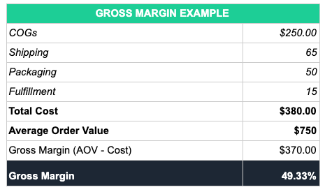
What a business, right?! But, wait! What about all of the work that goes into getting a customer their mattress? Shipping, packaging, your fulfillment team? When everything is included, you’re able to calculate Gross Margin.
GROSS MARGIN
The cost of sales (COS) divided by the gross sale price. Cost of sales refers to the direct costs attributable to the production of the goods or supply of services.
Here are the main items included in Gross Margin:
- Cost of Labor & Materials
- Shipping
- Packaging
- Fulfillment (i.e., storage, labor, machinery, rent)

CONTRIBUTION MARGIN
The “net profit” leftover after all variable costs associated with selling a product or service are deducted from the revenue generated. This includes discounts and refunds.
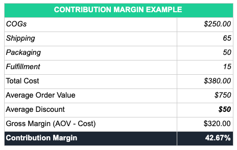

To keep Contribution Margin and Gross Margin distinct in your head, try thinking about Contribution Margin as the margin that “contributes” to the bottom line of the business.
An accounting caveat:
Many companies define things differently between product margin, gross margin, and contribution margin. For example, some companies:
- Separate gross margin and contribution based on fixed costs versus variable costs
- Include or exclude merchant fees (ie: fees paid to process credit card transactions) in margin. Some companies might not include merchant fees in their margin if they view them as bank fees or “overhead”. Many companies look at merchant fees as a variable cost that is part of generating revenue and thus part of margin.
- Include or exclude discounts in margin. One reason companies may exclude discounts if it’s a one time discount on a subscription product and thought of as part of a marketing cost to acquire the customer.
The most important thing to remember is that you understand the different components of your margin, that each definition is clearly defined, and that each metric is consistent across time periods.

SUMMARY OF METRICS LEVEL 1
Hopefully, your brain is already churning and making connections between CAC, Conversion Rate, AOV, and Margin and how they relate to and affect one another.
A helpful way to understand the interplay between these numbers is to take it to the extreme.
What should each be in a perfect world:

This is impossible. But, it’s useful to see a perfect scenario so that when you make decisions, you can better understand what tradeoffs you’re making.
Let’s run through a few examples where you could make tradeoffs depending on the goal and see what happens to the other variables.
Example Goal:
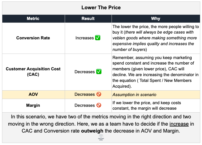
Lower CAC. To lower CAC, you can (among many other things):
- Improve the onboarding flow
- Lower the price
Example Goal:
Increase Margin. To increase margin, we can (among many other things):
- Increase AOV (i.e., increase the price)
- Decrease packaging costs
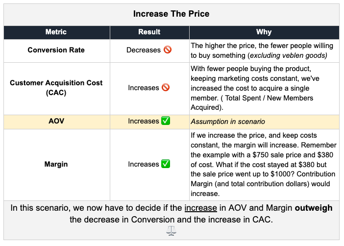
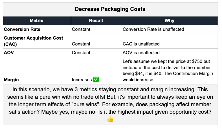
You can see how these metrics can affect one another and how you will have to make tradeoffs as you balance the short term and the long term.
In the next two sections, we’re going to look at a customer over time and your customer base in aggregate. We’ll take some of the questions we asked above, “Is it worth offering a lower price product?”, and add even more spice to it. “It depends on how well those members retain. Do they order additional products and services over time? If so, how much?”
Exciting stuff, right 😀?!
THE METRICS: LEVEL 2
In Metrics Level 1, we analyzed a customer’s journey from first hearing about your product to making a single purchase. In this section, we’re going to look at a customer’s journey from that first purchase moving forward.
RETENTION
There are so many ways to look at retention but, at their core, all retention metrics are trying to get at the same thing: are members continuing to use your product or service?
RETENTION
A measurement of the continued use of a product or service.
Let’s start with the most common form of retention for a non-software consumer subscription business: order retention.
Order Retention:
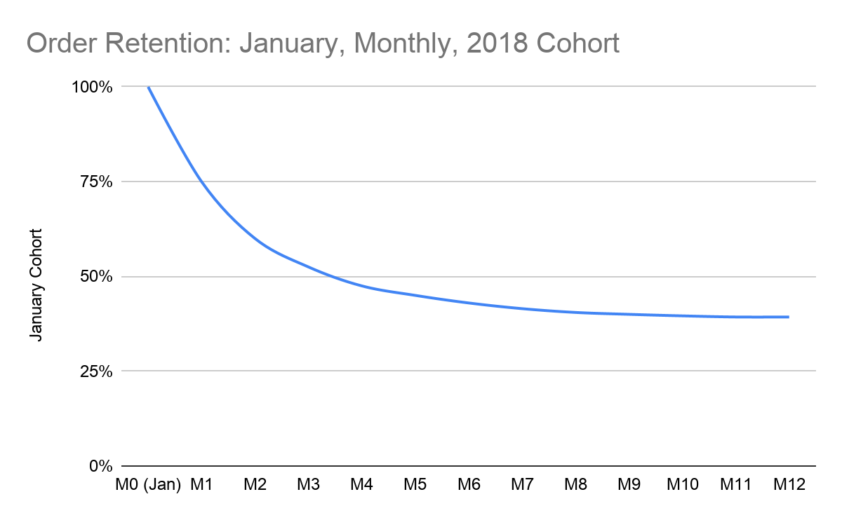
Let’s assume 1000 people signed up for your service for a monthly subscription in January. We’ll refer to them as the “January Cohort” (i.e., the people who signed up in January).
How many orders, on a monthly basis, has the January Cohort ordered since?

This table is showing that in the first month (i.e., January), 1000 people signed up and there were 1000 orders. In the second month, that same group of 1000 people, ordered 750 orders. In Month 12 (i.e., 13 months later), 393 orders were created.
If we look at retention on a percentage basis, what would it look like?

Looking at this chart, we can say:
- “Order retention for the January Cohort is 43% in M6 (i.e., 7 months out)”
- “We saw no decrease in retention from M11 to M12 and hope to see it stay flat or increase in M13”
We can also look at retention on a graph:
We looked at Order Retention for one type of member (i.e., monthly plans). What would the January Cohort look like if we looked at:
- Quarterly
- Vegetarian members (or Steak, Fish, Chicken, Breakfast Burrito)
- Members in their 20s (or 30s, 40s, 50s, 60s etc.)
- Members who ordered 2x meals per week
- Members who ordered 3x meals per week
By looking at your cohorts through a different lens (i.e., slicing the data in different ways) we can see what types of members retain the best.
As an example, let’s take a look at the graph below and see what it would tell us about your customer base.
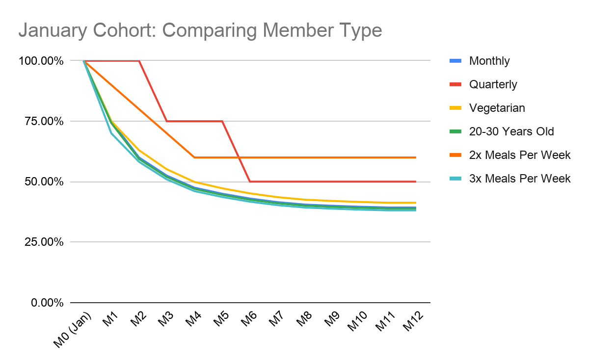
Looking at this chart, we can say, for the January Cohort:
- Quarterly has 50% retention in M12
- Members who order “2x Meals Per Week” retain the best 12 months out at 60%. Also, this group ‘flattens out’ or “asymptotes” by M4 (i.e., order retention does not decrease for this group after M4)”
- 20–30 year old members retain at almost the exact same rate as the Monthly members. I wonder if there is a high overlap between these members?
WHY IS RETENTION SO IMPORTANT?
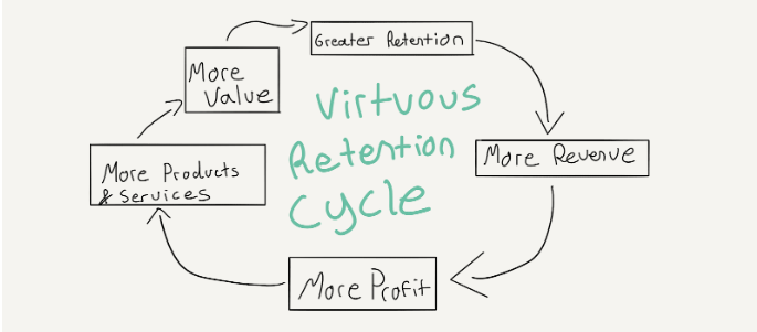
Retention is the primary indicator that you’re continuing to add value and have sustained product market fit. When a customer continues to pay for products and services, it is because you are continuing to add value to his or her life. This creates a virtuous cycle. Greater retention leads to more revenue, which leads to more profit, which leads to your being able to invest in offering additional products and services, which leads to greater retention and the virtuous cycle continues.
Let’s put some numbers behind this virtuous cycle 😀
PAYBACK PERIOD
Let’s take a look at our favorite January Cohort from above and instead of just looking at Order Retention, we’ll add Revenue Retention, assuming an AOV of $100 and a Contribution Margin of 50%.

So in M0, 1000 members spent $100,000 (i.e., you earned $100,000 in revenue), and you received $50,000 in Contribution Dollars.
But, how much did you spend in marketing to acquire these customers? What was your Customer Acquisition Cost?
If we assume a CAC of $200, and we acquired 1000 members, we spent a total of $200,000.
So in M0, we spent $200,000 to earn $50,000. Why would you do this? You would do this because you anticipate customers from the January Cohort continuing to purchase orders in the future (i.e., retaining).
So, the question becomes, how long does it take you to earn back the $200,000 you spent to acquire the 1000 members? Great question! This is called the Payback Period.
PAYBACK PERIOD
The time it takes for a cohort to pay back in Contribution Dollars the amount it cost to acquire the same group of members.

Looking at this chart, we can see that in M6 (i.e., 7 months after the January Cohort signed up), they contributed $211,500, which is greater than the $200,000 we spent in marketing to acquire them.
So the payback period is 7 months.
How can we decrease the payback period? How can we recoup the money we spent on marketing to acquire customers faster and therefore start to return a profit faster?
Assuming other factors stay constant, we can:
- Increase retention
- Increase contribution margin
- Increase AOV
- Decrease CAC
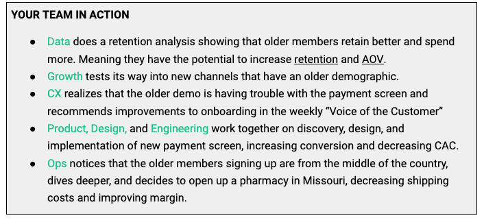
Think about all of the tiny details that would go into each one of those improvements.
LTV
Payback Period tells you how long it takes for a member to “pay back” the amount of money you spent to acquire them, but what about the rest of their relationship with you and your business?
That’s where LTV or Lifetime Value comes in.
Lifetime Value (LTV)
Lifetime Value is the cumulative contribution dollars (i.e., cumulative net profit) over the course of an entire relationship with a customer.
It’s impossible to know LTV from day 1. But, the longer you’re in business, the more data you’ll have, and the better you’ll be able to predict or estimate LTV.
Let’s use our trusty January Cohort again. What is the value of the member after 12 months?
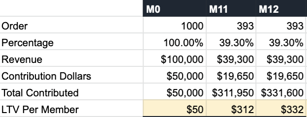
In this chart, we can see that the January Cohort has contributed a total of $311,950 by M11. If we have 1000 members in January’s Cohort, each member on average contributed $312 of Contribution Dollars (i.e., Net Profit) after 12 months.
Again, because we don’t know our full LTV, in this case we would say:
- “Our 1 year LTV is $312”
But what happens from months 12 to 24 to 36? Do customers continue to order?
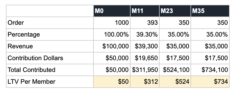
Since we don’t have enough data, we have to make an assumption. We can see that M11 and M12 show the exact same retention (i.e., retention has started to flatten out or approach an asymptote). Now, it’s only happened for 2 months in a row so, to be conservative, let’s assume that 35% of members continue to order from M11 to M23.
In this case, we would say:
- Our 1 year LTV is $312.
- Our 2 year LTV is $524.
- In the second year, members contributed $212 ($524-$312), of net profit.
We can extend M23 out based on the same assumptions and see what our 3 or 4 year LTV.
What are some of the things that might increase a member’s LTV?
- Increase in AOV (keeping margin and the frequency members order constant)
- Increase in Margin
- Increase in retention (i.e., more purchases of the same product)
- Signing up for additional products or services beyond their initial subscription
SUMMARY OF METRICS LEVEL 2
We’ve discussed Retention, Payback Period, and LTV and how they relate to one another. You want to increase Retention, which will decrease Payback Period and increase LTV.
THE METRICS: LEVEL 3
Almost there! We’ve discussed the journey of a customer from their first seeing your ad all the way to lifetime value as a customer. We’ve gone deep into how CAC, Conversion, AOV, and Margin all affect Retention, Payback Period, and LTV.
For the home stretch, we want to dive into three additional key metrics that provide insight into the health of a business. They shed light on whether your CAC is too high, whether your cohorts are trending in the right direction, and how you can improve the strength of your overall business.
LTV TO CAC RATIO
You might often read about the infamous LTV to CAC ratio. What does it mean? What is a good LTV to CAC ratio? And what underlying question is it trying to answer?
What does it mean?
The LTV/CAC ratio is the Lifetime Value of a member divided by the Customer Acquisition Cost. Remember, with LTV, it is important to attach a period of time to the ratio (i.e., 2 Year or 3 Year LTV).
Think of the LTV/CAC Ratio as the number of times a customer pays their acquisition costs. If a member costs $200 to acquire and over their entire life as a customer, you only earned $200, you wouldn’t make any profit from a single customer. They would simply payback the cost to acquire them. But, if you earned $600 from that same customer, they would have a LTV/CAC Ratio of 3 and would have paid the $200 you spent to acquire them 3x over.
In the example above, you had:
- 1 Year LTV: $312
- 2 Year LTV: $524
- 3 Year LTV: $734
If you had a $200 CAC, you would have a:
- 1 Year LTV/CAC Ratio = 1.56
- 2 Year LTV/CAC Ratio = 2.62
- 3 Year LTV/CAC Ratio = 3.67
What is a good LTV to CAC ratio?
The higher the LTV to CAC ratio, the better. A common heuristic that single product DTC companies will often use is to have an LTV/CAC ratio that matches the number of years the person has been a customer.
Meaning, ideally you want:
- 1 Year LTV/CAC = 1
- 2 Year LTV/CAC = 2
- 3 Year LTV/CAC = 3
However, there are many reasons why a company would choose to have a higher or lower LTV/CAC ratio. It will usually depend on industry dynamics (i.e., competition), capital markets (i.e., is the economy doing well, is fundraising easy or hard right now), and the product itself (e.g., enterprise software, meal kits, clothing, insurance, one time high AOV product).
For example, a company might choose to have a 3 Year LTV/CAC of 1 (instead of the “ideal” of 3). Why? The customers may have an extremely high LTV and there are high switching costs (i.e.,. the product is “sticky”). As a result, the company is willing to have a customer take 3 years to pay back because they know they will eventually pay for themselves many times over. Note: this approach would require incredible confidence in the LTV of a customer (e.g., years and years of data, multi-year contacts etc.) because 3 years is a long time for a customer to pay back.
Also, remember the “Virtuous Cycle of Retention.” Greater retention => more revenue => more net profit => more products and services => more value => greater retention.
If the cycle continues, the LTV of your customer increases. In this scenario, you could potentially increase CAC and keep the LTV/CAC ratio constant (i.e., equally efficient spend) and acquire more customers faster OR you could keep CAC constant, decrease the payback period, and start turning a profit sooner. The decision will heavily depend on your strategy and the market dynamics.
What underlying question is it trying to answer?
Ultimately, the LTV/CAC ratio is trying to see how efficiently you’re able to acquire customers.
LTV/CAC will not give you any indication of the size, durability, or potential of the business. It is one metric that can be used to see if a company is spending too much, too little, or just the right amount to acquire members. It can also change as your strategy and product mix evolves.
Note: Another way to think about the Payback Period, is when the LTV/CAC = 1 😀. Fun when math works like that, right?!
NET REVENUE RETENTION
We looked at Order Retention with a single product. But, what about Revenue Retention? One of the best ways to do this is to look at Net Revenue Retention and Net Profit Per Member Over Time. Let’s tackle these one at a time. First, Net Revenue Retention.
NET REVENUE RETENTION
Net Revenue is the revenue remaining after all discounts, credits, and allowances are applied. It is the revenue “net” of discounts and returns.
Let’s revisit our January Cohort.

Based on this chart, we can say:
- “Net Revenue Retention is 41.5% in M7 (8 months out)”
What is the difference between Net and Gross Revenue?
Gross Revenue includes promotions (i.e, discounts), member credits, and other allowances (e.g., returns).
A quick example:
- Customer comes in and gets a $20 discount
- Customer’s purchase is originally $100
- Gross Revenue = $100
- Net Revenue = $100-$20 = $80 (we subtracted the discount)
Note: this is why you should pay close attention to the difference between Gross & Net revenue. Are you giving out more credits than usual? Are people returning their purchase? Are people only purchasing because of a steep discount?
What is the goal for Net Revenue Retention?
Ideally, NRR is greater than 100%. This means one of the following is true:
- Retention is 100% (i.e., no one has churned) and a non-zero percentage of people have signed up for a second product
- Retention is below 100% for the initial subscription but, of those who have retained, they spend more than the original group did in their first month over time.
For # 2, this comes from:
- using the same product more
- using an additional product
- both of the above
This means the value of the additional products offered is greater than churn! And given churn is inevitable, the second option is far more likely (and the holy grail).
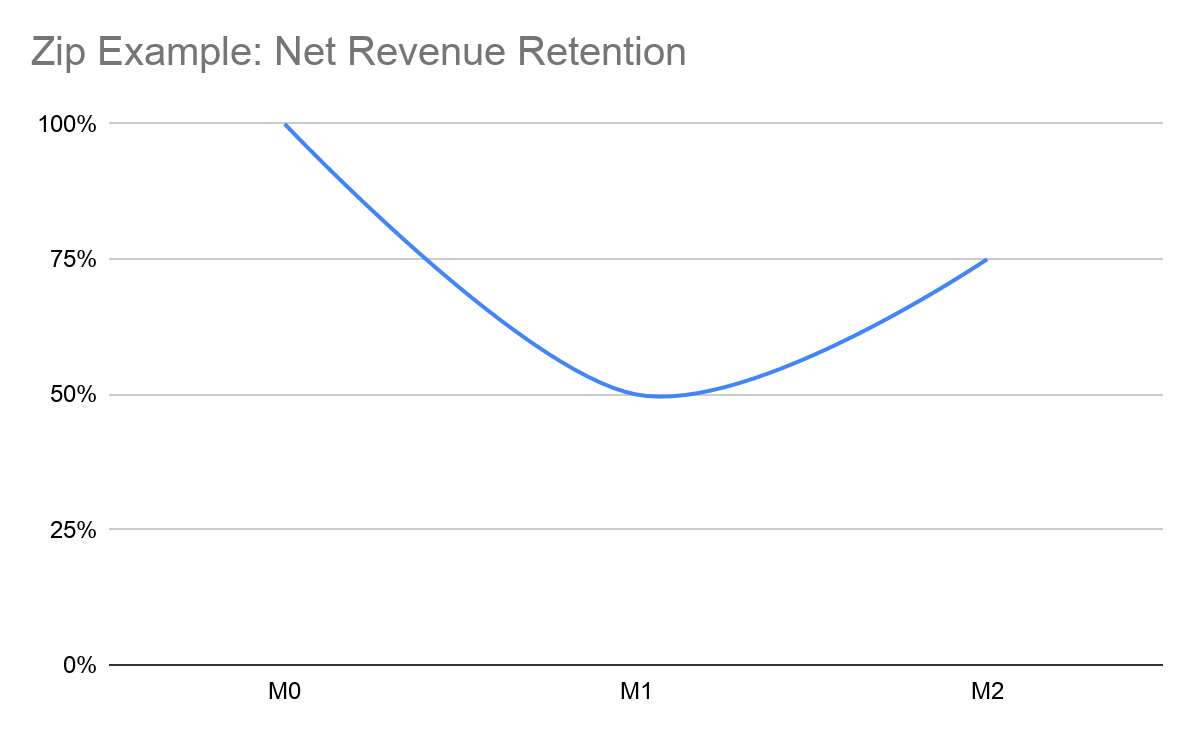
Let’s use a fictional ride-sharing company called Zip as an example.
- 1000 people sign up for Zip and in the first month, they take 1 ride to the airport. It costs $50 to acquire these customers.
- In the second month 500 people take another ride to the airport for the same $50 (churn was 50%).
- In the third month, that same 500 take another ride to the airport for the same $50 (wow, these people love to travel). But, they also take a ride to dinner on Friday night for $25.
Net Revenue Retention would look like this:

Now imagine what happens when Zip launched or launches:
- Zip Pool
- Zip Eats
- Zip Bikes
- Zip Scooters
- Zip Subway
- Zip Bus
- Zip Planes
Ultimately, Net Revenue Retention is able to tell your whether or not your customers are spending less, more, or the same amount over time. If they are spending more over time, it means the products and services are becoming more valuable to each customer.
NET PROFIT PER COHORT PER MEMBER
Net Revenue Retention shows the topline health of the business (i.e., are customers in aggregate spending more, less, or the same over time). But, NRR does not give an indication of whether you are making net profit from customers.
Let’s take the example of where you give the first month free
- Gross Revenue: $100
- Net Revenue: 0
In M1, Net Revenue Retention would be more than 100% as long as a single customer ordered in the second month because you’re starting from $0. So, any amount of money spent by the cohort in the second month would be considered “retained” relative to the first month.
This is why you should look at Net Revenue Retention along with Net Profit Per Member Per Cohort. One shows the top line growth and the other shows the profit growth. Let’s dive in further.
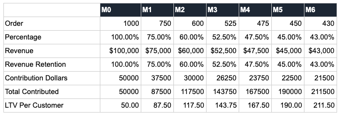
Look at the last line item 😉. It is the Net Profit that a single customer from the cohort has added month over month, if we look at each month individually.

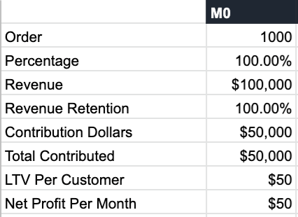
In M0, the 1000 members from the January Cohort added $50 in profit per member. Let’s zoom in.
But, in M1, the same 1000 members added $38. Why? Let’s zoom in again.
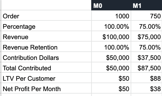
The $37,500 in contribution margin in M1 was the result of 750 orders at $100. But remember, we’re comparing it to the original 1000 customers in M0. So on a per customer basis:
- M0 Contribution Per Customer = $50,000 / 1000 customers = $50
- M1 Contribution Per Customer = $37,500 / 1000 customers = $37.50
The 1000 customers produced less revenue in total (and on a per customer basis) in M1 because 250 customers churned.
With churn, on a per customer basis, the cumulative profit per cohort decreases over time. Let’s take a look again.

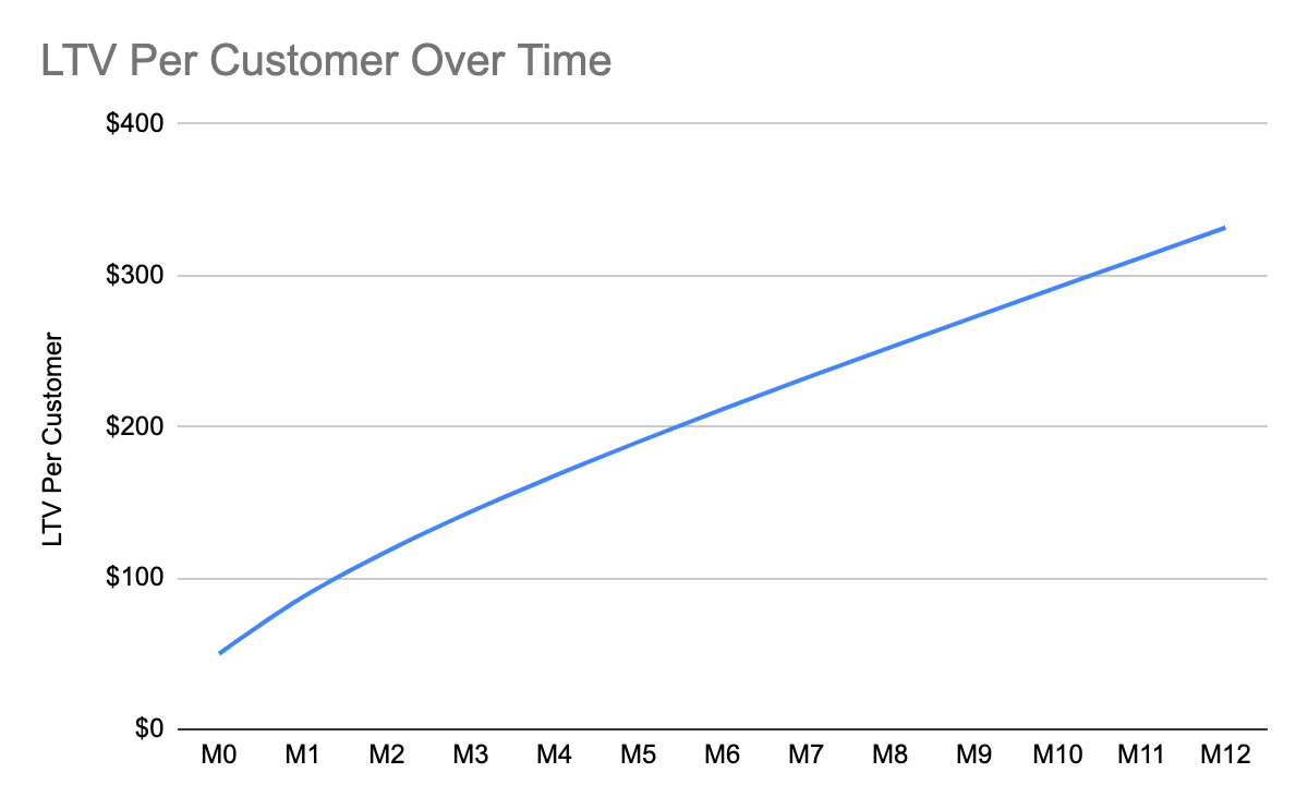
Now what happens if churn continues?
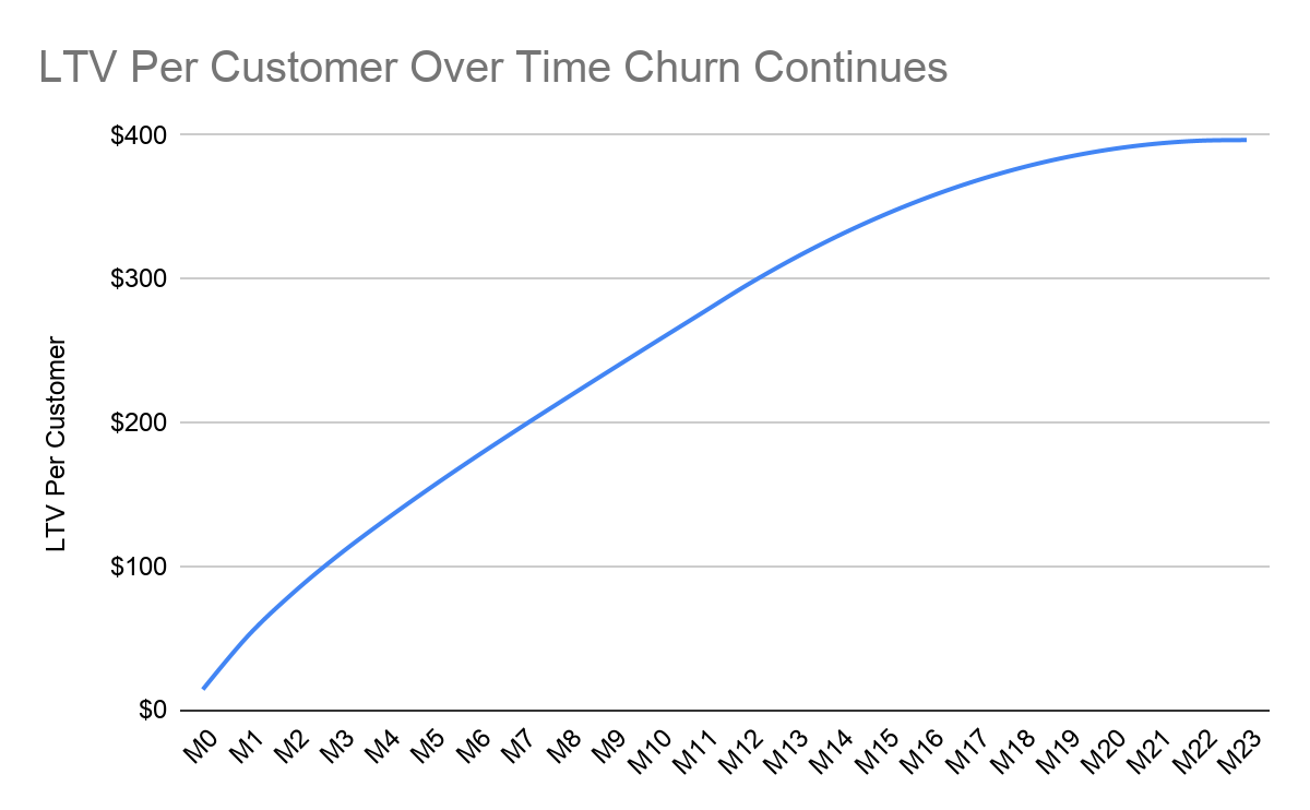
What does this chart say?
- Over time, the Net Profit Per Cohort (i.e., the cumulative contribution dollars) is 0 at M24.
- Members have either: stopped ordering or continue to order but you are making 0% Contribution Margin on every order.
- The cohort is adding no additional profit to your business.
Now what happens if retention increases or existing members sign up for additional products?

Looking at this chart, we can see:
- At M13, Cumulative LTV per member starts to increase at a faster rate (i.e., $21 per month instead of $20 per month in M12). This could be the result of customers order more of the same product or service, customers sign up for an additional product or service, or both.
- The trend seems to continue in M14. This could mean that your company is becoming more and more valuable to the customers you’re serving.
Let’s take a look at the graph.
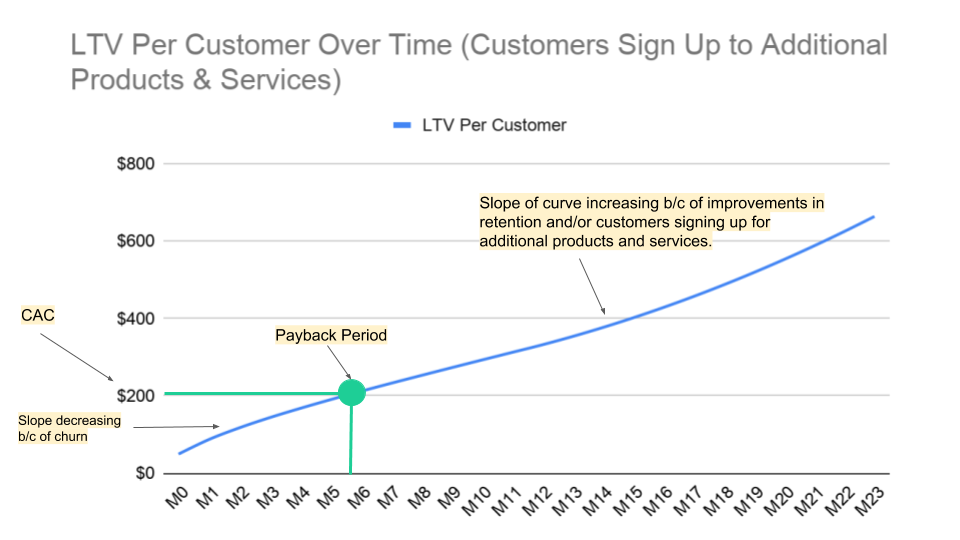
Looking at this graph, we can say:
- The payback period occurs in M6 (7 months out). This occurs when the cumulative LTV per member is equal to the CAC (i.e., The LTV/CAC ratio is equal to 1).
- The curve slows down between M1 and M8, showing that the cohort is adding fewer dollars of profit in each consecutive month, most likely to due to churn. Note, if we were to look into churn and see that churn was not the cause, it could be that you are offering more discounts or refunds to customers so profit is decreasing.
- The slope of the curve increases in M12 through M13. This could be because churn is decreasing, customers are signing up for additional products or services, margin is increasing faster than churn.
SUMMARY OF METRICS LEVEL 3
In the final section we discussed LTV/CAC, Net Revenue Retention, and Net Profit Per Member Over Time. These three metrics can be incredibly valuable when trying to identify trends or areas of improvement. It’s important to never look at just one in isolation and assume the whole picture. They each tell only part of the story.
A MODEL TEMPLATE
Last but not least, we made a payback template model for you to play with on your own. It even has its own cool heat map with toggles and everything :)
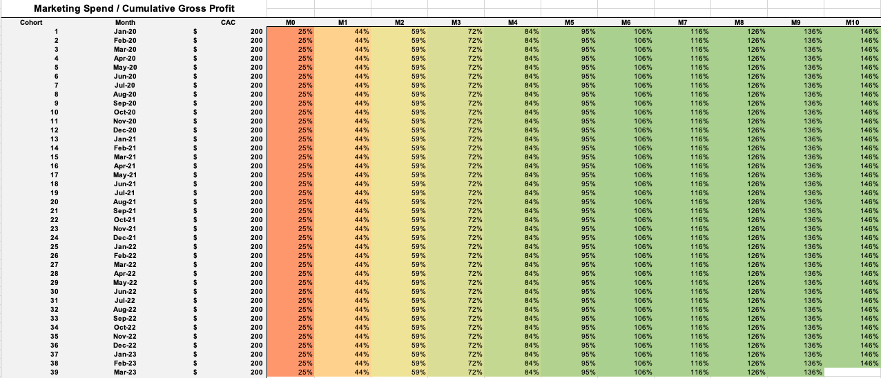
You can download the excel file and the readme here. We hope it’s helpful and appreciate any feedback at aron@ro.co or zachariah@ro.co.
Thanks for reading. Sincerely. We know this was a monster of a blog post. We hope it was genuinely helpful. Also, if this is the type of stuff that excites you, we’re looking to hire across the board. Check out job openings at Ro.co.
Zachariah Reitano
CEO and Co-founder, Ro
Zachariah is the CEO and cofounder of Ro.
Founded in 2017, Ro is a patient-driven healthcare company that puts you in control of your health. Ro powers three digital health clinics -- Roman (men’s health), Rory (women’s health) and Zero (addiction treatment) -- providing a personalized end-to-end telehealth experience from diagnosis to delivery.
As CEO and cofounder, Zachariah leads medical and regulatory operations and oversees all digital clinics. Prior to Ro, he was Entrepreneur In Residence at Prehype, a leading venture studio in NYC. He also previously founded Shout, a mobile Craigslist backed by Accel and YC.
Zachariah was named Inc. Magazine’s 30 Under 30, Forbes 30 Under 30, Business Insider’s 30 Under 40 in Healthcare, and EY’s Entrepreneur of the Year for New York. Ro was named #2 in Wellness on Fast Company’s 2019 list of the World’s Most Innovative Companies, and listed by Crain’s as a Best Place to Work in NYC.
Aron Susman
SVP Finance, Ro
Aron is the Senior Vice President of Finance at Ro.
Founded in 2017, Ro is a patient-driven healthcare company that puts you in control of your health. Ro powers three digital health clinics -- Roman (men’s health), Rory (women’s health) and Zero (addiction treatment) -- providing a personalized end-to-end telehealth experience from diagnosis to delivery.
In his role, Aron oversees the entire finance organization including FP&A, accounting and investor relations.
He joined Ro (formerly Roman) in early 2018. Previous to Ro, Aron was the co-founder and CFO of SquareFoot, a venture-backed commercial estate technology company, and also served as a senior finance leader at MM. LaFleur, a DTC women's workwear brand. He started his career in the Private Equity group at Deloitte.
Aron graduated from the University of Texas at Austin, where he earned a master's degree in accounting. He holds a CPA license in TX and NY.
The views and opinions expressed herein are the views and opinions of the author and do not necessarily reflect those of Nasdaq, Inc.